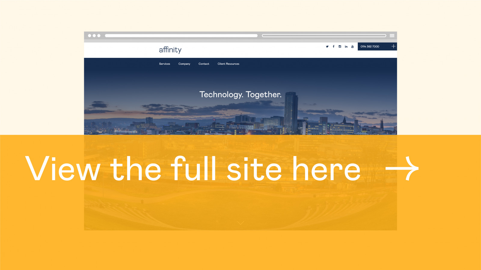
Affinity IT is a local family owned business providing innovative products and IT solutions. Affinity required a full rebrand and a sleek new website to help them communicate with their existing customer base and draw new clientele. Field took onboard the requirements and objectives of the project and involved the client at every stage to create a confident, fresh brand and website.
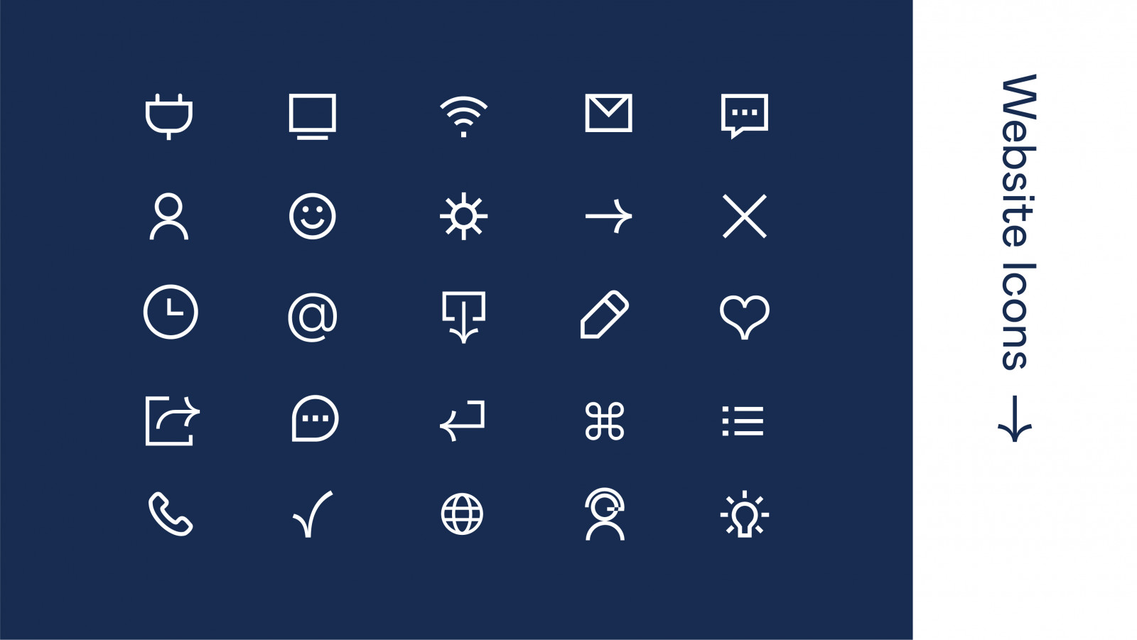
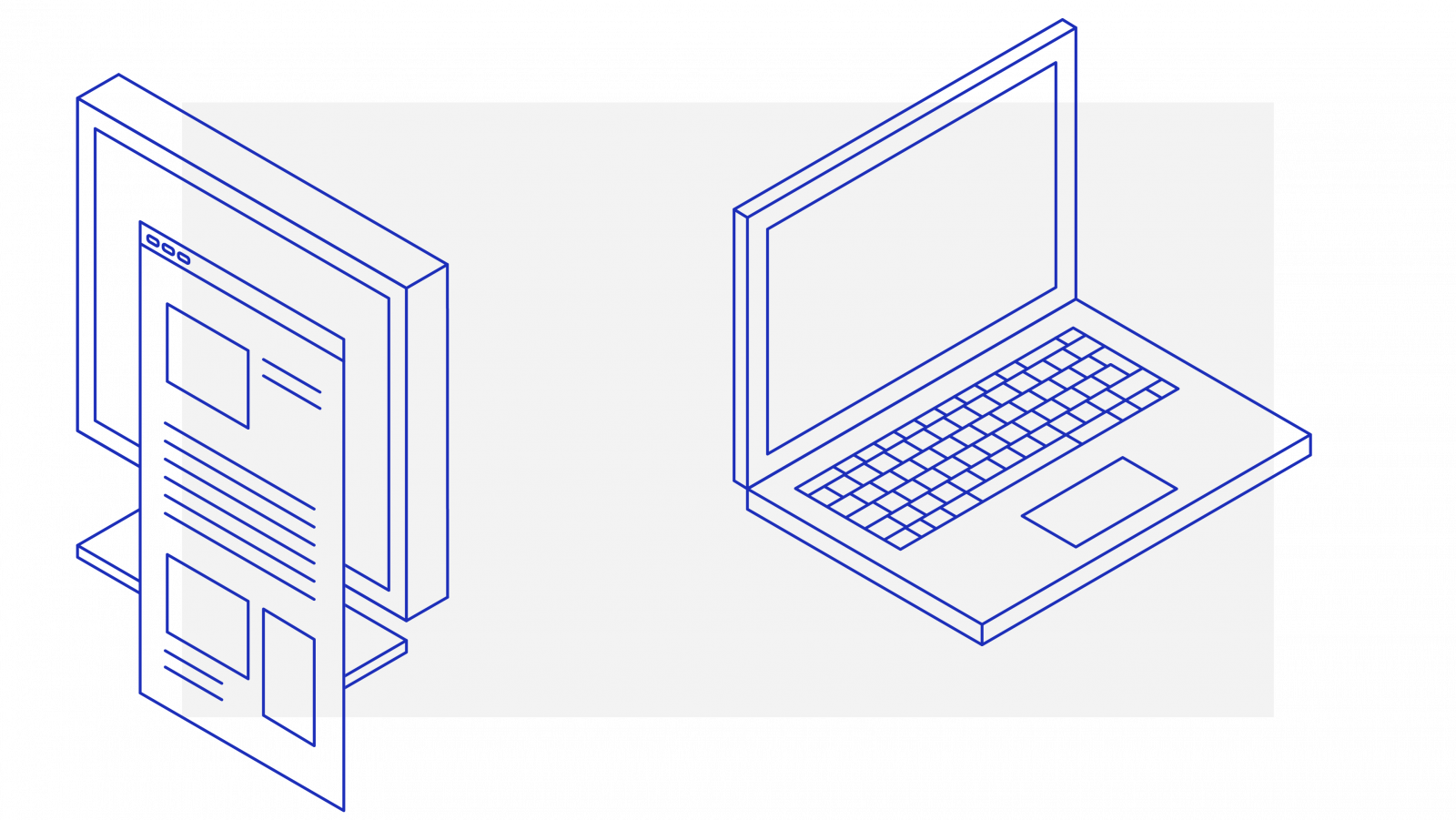
The rebrand includes a new logo and a switch to Mabry as the in-house font, supported by a refreshed colour palette and a library of isometric icons which help to depict Affinity’s technological services in a simple and sleek way. Photography also plays a key role in the Affinity brand, injecting life and personality into a typically mechanical industry.
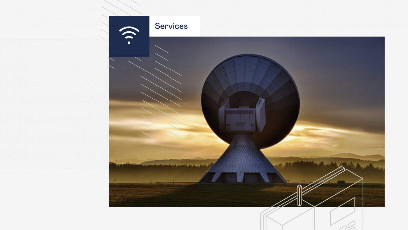
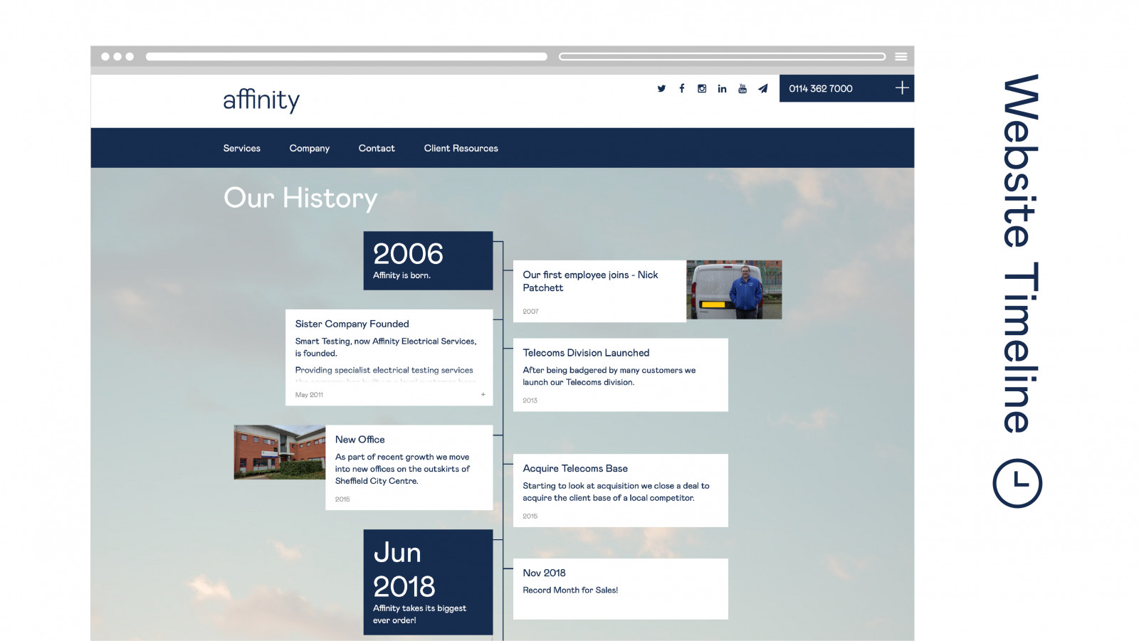
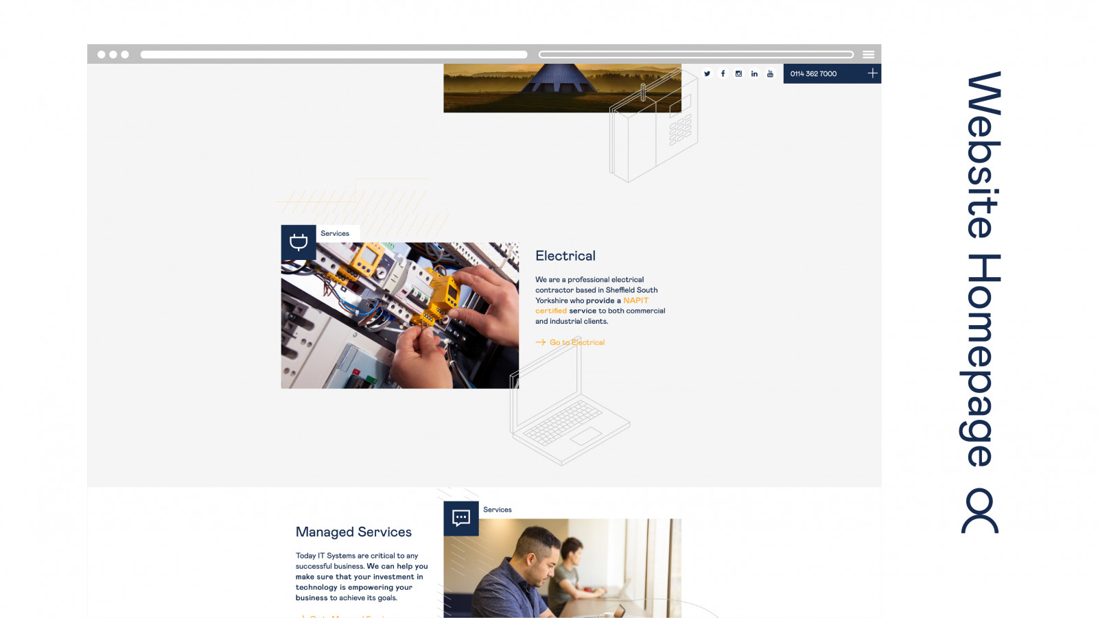
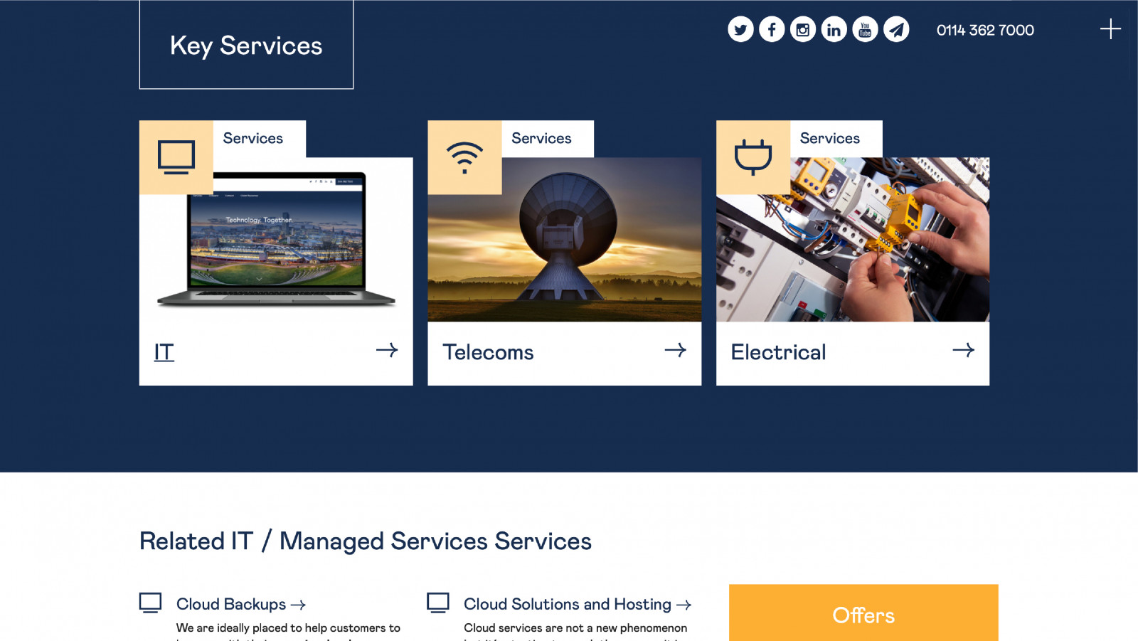
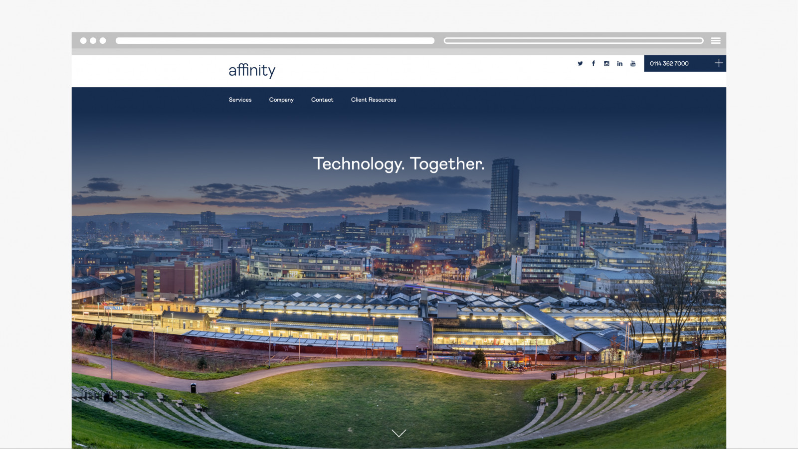
This clean, professional brand extends to the Affinity IT website. The illustrations interact with the content, supporting the copy and overall message, while use of colour serves to create visual hierarchy on a page. The website needs to house a large amount of content, therefore we developed a menu structure with a clean, clear tiering system. Design plays a key role in the functionality of the site with consideration for space and flow, creating an easy to navigate, professional website.

